Introduction
Here, we will learn about Power Bi most frequently usable visualizations Matrix & Table.
Description
Matrix & Table both work same to Display Data into Report. The main difference between Matrix & Table are Table Display data Row wise & in Matrix we can display Data Row & Column wise.
In table we cannot aggregate the Data & Matrix automatically aggregate the data this is one of key feature of Matrix in Power Bi Desktop.
Let's start with example, here we have one sample data with three fields like Customer Name, Customer Segment & Discount. In this data we have multiple entries of same users with different different Discount. Means, Customer Name & Segment are same only Discount is changing for users.
So, if we will display this data into Table visualization, it will show all rows same like below image left side visualization.
And when we display same data in Matrix Visualization, it will aggregate the data automatically and enables the drill down icon same like Right side Visualization.
For Data Analysis purpose Matrix Visualization is good and easy to understand. In Matrix we can transform the Data Column wise as well.
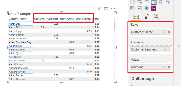
See below screen shot, here we displaying data column wise to using Matrix three property Rows, Column & Value.
Hope you enjoyed the post. Your valuable feedback, question, or comments about this post are always welcome.


